

“Typefaces are not only there to be read, you also see them.”
- Hans Peter Willberg
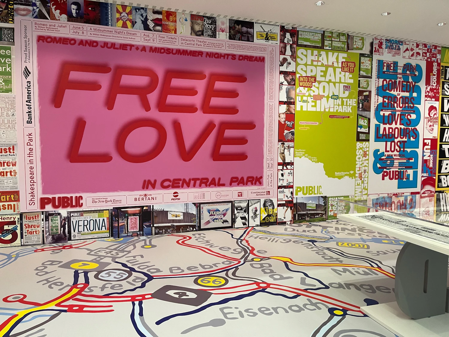
In addition to art and photography, I also have interest and experience in graphic design, so when I'm out and about I'm always on the look for interesting typography "in the wild" to use as additional source imagery for this ongoing mashup series. And usually, the more retro the style and the more grungy the look, the better. An interest in using letters and numbers as compositional elements can also be seen in the work of designer Paula Scher (see more about her after the gallery below).


Type Cast
Paula Scher has been a pioneer in graphic design for over five decades. In her Type is Image exhibition on display at Die Neue Sammlung (The Design Museum) in Munich, Germany, from June 2023 to September 2024, "from the floor to the walls to the hanging letters and posters, visitors are surrounded by Scher’s works."
"Scher is guided by her belief that 'words have meaning, and type has spirit'––that people recognize type and understand the emotion, wit, power, beauty and other human sensibilities behind it without reading. Following the early advice of a teacher to 'illustrate with type,' she has explored this idea throughout her career."
Sources: dnstdm.de, pentagram.com